Are Brands Losing Their Souls?
They say that change is the only constant in life and brands are not immune. There are a multitude of reasons why an entity would want to rebrand, whether it’s to appeal to a new market, embrace new technology, adopt new products or services or even as a result of a major global event, such as a pandemic.
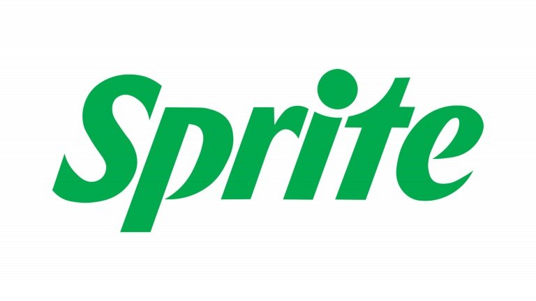
The cost of rebranding may not just be financial, but in fact the brand’s personality. In May 2022, Coca Cola rebranded Sprite as part of their ‘Heat Happens’ Campaign. The new typographic logo was bold and contemporary aimed at a younger, universal audience. The starburst of the previous logo was relegated to distinguishing new flavours and not a lemon or lime in sight.
While this new logo meets the brief, it doesn’t provide consumers the same emotional connection as the original and is hardly memorable.
The rebrand was consistent with the recent rebrand of the Coca Cola range, where any adornment was removed from the packaging and the logo moved higher to represent the 'uplifting experience' that Coca Cola gives you.
This minimalist approach to branding is not new. In 2017, BHP Billiton dropped its name and its infamous ‘blobs’ at a cost of $10m, to be represented by three letters: BHP. Bold and contemporary? Sure - but what insight does that provide? The ‘blobs’ represented the unique outback landscape of Australia and the earth at the core of its business and easily was identifiable as BHP.
The most costly minimalist rebrand though arguably occurred in 2010 when Gap decided to rebrand their traditional logo with a contemporary new version. It lasted a whole week before consumer backlash was so extreme they were forced to revert back to their old logo. There was no apparent brand rationale behind the rebrand and conversation with its loyal consumers. This not only cost Gap an estimated $100 M, but its reputation.
Conversely, automotive brands have been relatively successful in simplifying their brands.In the last two years Buick, Renault and BMW have all chosen simplified versions of their original logos which represent their future ambitions and adoption of new technology, without sacrificing their heritage.
Brand design is an art and can have a significant impact on a company’s bottom line. After rebranding in 2008, sales of Woolworths increased by 6.5% to over 12b. Whilst their objectives are honourable, my concern is that brands are becoming homogeneous with little personality, that not only differentiated them from their competitors, but made them great in the first place.
The impact of rebranding goes far beyond simply changing a logo. As the case studies above represent, it can have serious consequences on a consumer’s trust in a brand. A brand logo has the power to alienate consumers or build loyalty within them. Do most brands underestimate the power their logos carry? Gap clearly didn’t consider their customer base when redesigning their logo, resulting in huge financial loss. What cannot be determined is the financial cost of any customer trust damaged during this process, which you could argue is the most critical to Gap as a business and a brand.
With most of this change manifesting as simplification, are brands losing their souls?
Team Contributor: Michaela Scott
Get in touch: michaela.scott@arrowvane.com | Linkedin
Subscribe to The Quiver newsletter here


